Beautiful Gardens, landscaping, art, printing For Your Home And Garden!
Beautiful Gardens, landscaping, art, printing For Your Home And Garden!
Oriental ink home decor brings calm, movement, and nature indoors. Learn how to layer it across rooms and gardens with a modern, livable eye at home, too.
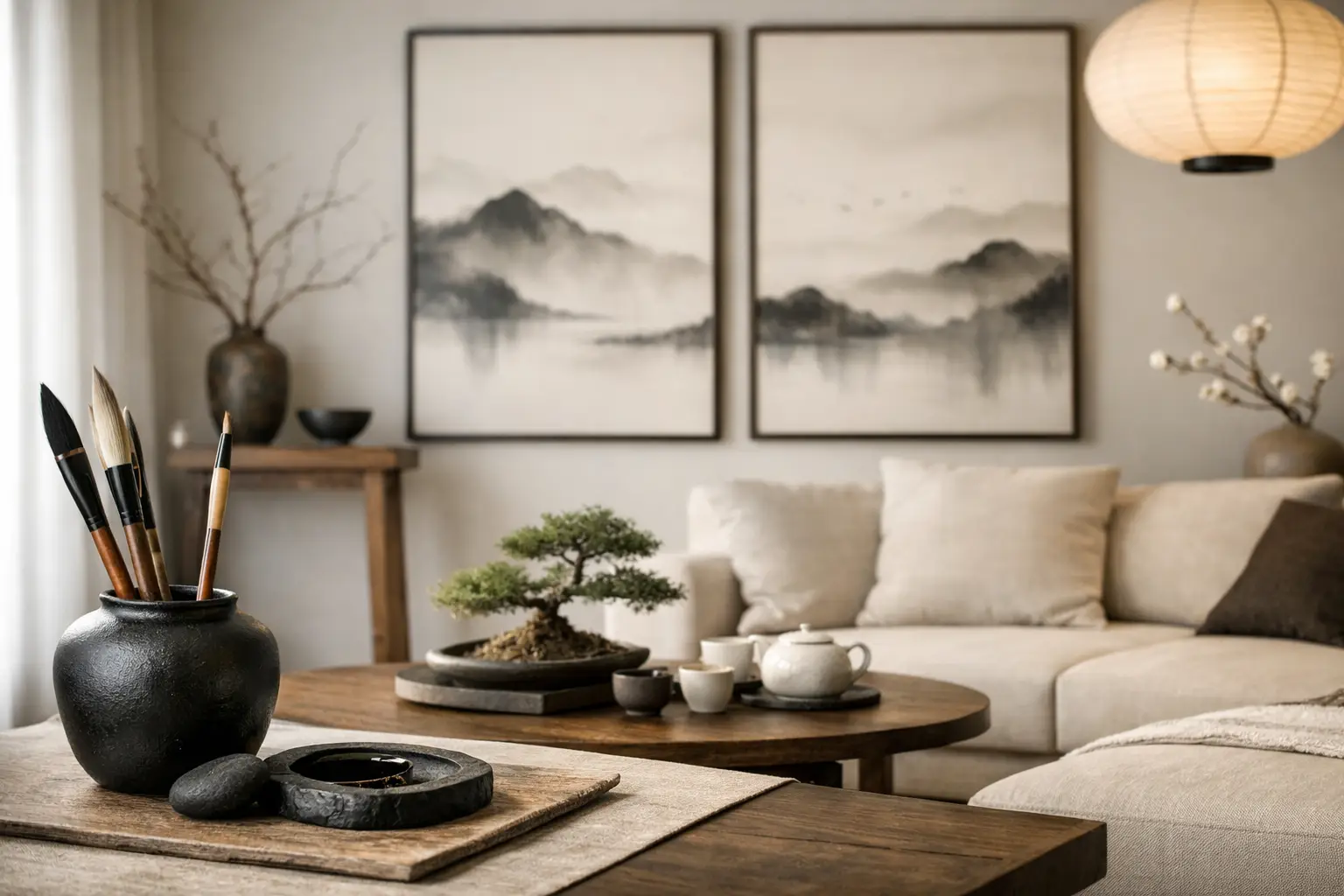
A room can be full of beautiful objects and still feel restless. Often, what is missing is not another accessory but a visual pause: a wash of soft black, a quiet horizon, the suggestion of mist across a wall or textile. Oriental ink home decor creates that pause. Rooted in the expressive language of East Asian ink painting, it brings movement, nature, and restraint into spaces that need to work hard for modern family life.
This is not about turning a home into a themed set or filling every surface with bamboo motifs. The most compelling ink-inspired interiors use contrast with care. A fluid landscape print can soften the clean line of a sofa. A dark brushstroke can give a pale patio room a center of gravity. A garden textile can connect an indoor reading corner to the changing sky beyond its doors.
Ink painting is built on an economy of marks. A few strokes may imply a mountain range, wind through reeds, distant water, or the weight of an ancient pine. Empty space is equally active. That balance makes the aesthetic especially relevant to homes that already carry the noise of daily life: shoes by the door, school bags, meals, pets, devices, and the lovely disorder of a house being used.
In a contemporary setting, ink-inspired decor offers three useful qualities. It adds depth without visual clutter, because tonal variation does much of the work. It creates a link to nature without requiring literal botanical decoration. And it ages well, because black, charcoal, soft gray, stone, sand, and muted green can shift easily around changing furniture and seasonal planting.
The term “Oriental” is broad, while ink traditions across China, Japan, Korea, and other Asian cultures have distinct histories and visual languages. A thoughtful home takes inspiration with specificity and respect. Look for designs that acknowledge brushwork, landscape composition, paper-like texture, or botanical forms rather than relying on generic symbols. The goal is a living connection to an art practice, not a decorative shorthand.
The easiest way to bring this look home is to choose one large, expressive piece and let the surrounding room breathe. In a living room, that might be an ink landscape blanket folded over a linen sectional, or a large art print above a low console. In a bedroom, a misty mountain textile can replace the need for multiple competing pillows and wall accents.
Scale matters. A small ink motif can disappear in a large, open-plan room, while an oversized, high-contrast piece can dominate a compact apartment. If your room has low light or many dark finishes, favor paintings with generous white space, diluted washes, and warm neutral undertones. In bright rooms with pale walls, a stronger black brushmark or deep indigo landscape can create welcome definition.
Treat the focal point as a composition rather than a color swatch. The eye should be able to travel from its dark marks toward quieter materials nearby: oak, travertine, woven grass, unglazed ceramic, brushed metal, or softened cotton. This rhythm is more convincing than matching every item to black and white.
One common mistake is to place ink art in a crowded gallery wall or layer it with patterned rugs, loud cushions, and busy shelving. Ink imagery needs room around it. Keep the adjacent wall relatively clear, reduce the number of small decorative objects, and use lower furniture profiles when possible.
Negative space is not empty in the unfinished sense. It gives the eye a place to settle, much like an open patch of sky in a garden border makes the planting feel more abundant.
A successful ink-inspired home feels tactile. Pair printed surfaces with materials that feel grounded and slightly imperfect. Natural wood, linen, wool, clay, rattan, weathered stone, and matte finishes all support the quiet texture of brushwork.
Avoid making every element monochrome. Pure black and bright white can look sharp, graphic, and even cold if there is no tonal bridge between them. Bring in bone, mushroom, tea brown, faded olive, mineral blue, or muted terracotta. These colors recall soil, bark, water, and aged paper while keeping the space warm enough for everyday use.
For a more architectural interior, use ink art beside smooth plaster walls, blackened steel frames, and sculptural lighting. For a softer family home, combine it with washable textured throws, rounded wood tables, and generous upholstered seating. Neither direction is more authentic. The right choice depends on how your household actually lives.
The strongest homes do not stop their visual story at the glass door. When the living room opens to a balcony, deck, or garden, ink-inspired design can become a gentle bridge between interior calm and outdoor life.
Start with the view. An ink landscape is rarely about a perfectly symmetrical scene. It suggests layers, distance, seasonal change, and the energy of weather. Translate that idea into planting with varied heights and loose, natural groupings. Grasses can provide the lightness of brushwork. Evergreen structure offers darker, steadier marks. Flowering perennials and seed heads introduce temporary washes of color.
This approach works especially well for the 2026 preference for gardens that look alive rather than over-managed. Choose drought-tolerant and regionally appropriate plants where possible, then let their silhouettes do some of the decorating. A garden designed for pollinators, birds, and healthier soil has more movement and texture than a lawn-and-hedge formula. It also asks less of you over time once plants are established.
Outdoor textiles are useful connectors. An art-printed towel or blanket in a shaded lounge area can echo the tones of the interior without requiring a complete patio redesign. Place it near natural timber, stone planters, and soft evening lighting, then allow the actual landscape to remain the main event. Fensgarden approaches this meeting point between water-ink art and outdoor living as a practical design language, not a costume for the garden.
Outdoor decor has to withstand sun, moisture, pollen, and frequent use. Reserve delicate pieces for covered porches or enclosed sunrooms. On open patios, choose fade-conscious textiles, planters with drainage, furniture that can handle changing temperatures, and plantings suited to your climate.
The trade-off is simple: the more exposed a space is, the more edited its accessories should be. Let durable structure and plants carry the composition, then add artful layers that can be brought in, washed, or stored when the season turns.
Bedrooms and bathrooms are natural homes for ink-inspired decor because the palette encourages a slower tempo. In a bedroom, choose one textile with a diluted wash pattern and repeat its undertone in a ceramic lamp base or bedside vessel. Keep lighting warm and directional. Cool, bright overhead lighting can flatten the subtlety that makes ink art feel atmospheric.
In an entryway, use a more assertive piece. A dark ink print above a narrow bench creates a moment of arrival, especially when paired with a simple branch arrangement or a sculptural planter. Because entries collect practical clutter, choose easily cleaned finishes and leave enough open space for real life.
For family rooms, durability takes priority. Ink-inspired blankets, washable pillow covers, and framed prints behind protective glazing give the room its character without making anyone nervous about spills. Artful homes should invite use, not demand constant protection.
The lasting appeal of oriental ink home decor is its refusal to explain everything at once. A landscape might suggest a place you have visited, a climate you miss, or simply the feeling of rain moving across a window. That openness gives a home emotional range.
Choose pieces that leave room for your own memories, then place them where daily rituals can meet them: beside the chair where you read, near the table where the family gathers, or at the threshold between the indoor forest of houseplants and the outdoor garden. A few considered marks, like a few well-placed plants, can make a home feel more spacious, more rooted, and more fully alive.