
Beautiful Gardens, landscaping, art, printing For Your Home And Garden!
Beautiful Gardens, landscaping, art, printing For Your Home And Garden!
Oriental ink painting home decor adds calm, character, and artistry to modern spaces with layered textures, natural palettes, and personal style.
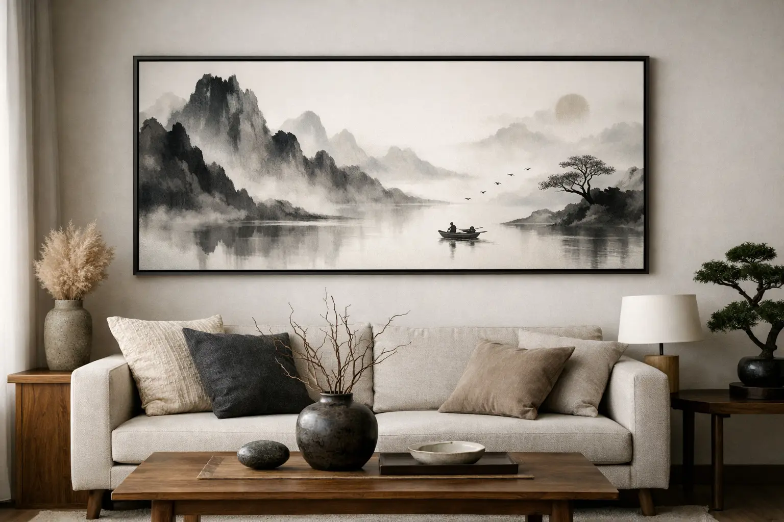
A room can have beautiful furniture, good light, and expensive materials – and still feel flat. What often changes that is artwork with atmosphere. Oriental ink painting home decor brings that missing layer: softness without blandness, drama without visual noise, and a sense of culture that feels lived in rather than staged.
For design-minded homes, this style works because it is both expressive and restrained. Ink landscapes, botanical brushwork, mountain silhouettes, and watery gradients create movement, but they do not crowd a space. That balance makes them especially compelling for people who want their home to feel curated, personal, and calm at the same time.
The appeal is not just tradition. It is the way traditional ink aesthetics translate into modern interiors. In a market full of overly polished prints and trend-driven decor, ink painting introduces irregularity, negative space, and hand-touched character. Those qualities make a room feel more human.
There is also a practical reason it resonates now. Many American homes are visually overloaded – open shelving, mixed finishes, multiple accent colors, constant accessories. Ink painting offers relief. Its language is quieter. A misty mountain print, a branch rendered in soft black tones, or a textile with fluid brush marks can settle a room without making it feel sparse.
That said, this style is not limited to minimalist interiors. It can warm up contemporary homes, add contrast to rustic spaces, and bring refinement to bohemian rooms that need more visual discipline. The key is not to treat it as a theme. It works best when used as an artistic influence, not a costume.
Oriental ink painting home decor relies on a few visual ideas that matter more than any single motif. The first is contrast. Ink painting often plays deep black or charcoal against open, pale ground. In interiors, that can translate into dark linework on soft textiles, a bold wall print in a neutral room, or black ceramic accents paired with warm linen and wood.
The second is negative space. Western decorating often rewards filling every corner. Ink aesthetics do the opposite. Empty space is part of the composition. In a home, that means letting a statement piece breathe. If you hang an ink landscape above a console, you do not need to crowd it with five smaller objects. If your blanket carries a painterly bamboo motif, the rest of the bed can stay simple.
The third is natural rhythm. Traditional ink painting is deeply connected to landscape, weather, water, stone, and plants. That makes it especially compatible with materials like oak, walnut, cotton, linen, ceramic, and textured glass. The style feels strongest when the art and the materials are in conversation.
The living room is often the easiest place to begin. A large-scale ink-inspired throw, a framed landscape print, or a pair of cushions with brush-painted reeds can shift the mood of the entire space. Because the palette is often grounded in black, gray, taupe, moss, or faded blue, these pieces layer naturally into existing decor.
Bedrooms are another strong match. Ink painting has a naturally restful quality when used with restraint. On textiles, especially blankets and decorative layers, the effect is intimate rather than formal. A bed styled with soft solids and one painterly focal piece usually feels better than a full matching set. The room stays elegant, but not rigid.
Dining spaces benefit from this language too, though in a slightly sharper way. Here, ink motifs can appear through table linens, wall art, ceramic serving pieces, or even nearby planters if the dining area opens to a patio or garden. The goal is to create continuity between the indoors and the natural world outside.
Outdoor living spaces are an overlooked opportunity. Ink aesthetics are rooted in landscape, so they feel surprisingly at home on patios, porches, and garden seating areas. A textile with mountain or botanical brushwork, paired with weathered wood and greenery, feels aligned with the setting rather than imposed on it. This is where a design-driven brand like Fensgarden has a distinct advantage: the visual language can move across blankets, soft goods, and garden-adjacent pieces without losing coherence.
The biggest mistake is overcommitting to symbols. If every item in a room features cranes, bamboo, calligraphy, and pagoda silhouettes, the result starts to feel decorative in the shallow sense. A better approach is to focus on mood, line, and material.
Start with one anchor piece. That could be a blanket with wash-like brush textures, a framed ink landscape, or a textile with abstract botanical movement. Then support it with solids and textures that echo the artwork rather than repeat it. Think stone-colored upholstery, blackened metal, pale wood, matte ceramics, and muted green from plants.
Scale matters too. Fine brushwork is beautiful up close, but it can disappear in a large room if everything else is oversized. In bigger spaces, look for designs with enough contrast and gesture to hold their own. In smaller rooms, subtlety can be an asset. A delicate mist-and-mountain composition may feel sophisticated in a reading nook or guest room where a louder print would overwhelm.
There is also a cultural consideration. People are increasingly sensitive to decor that borrows from traditions without understanding them. The answer is not to avoid the style, but to approach it with taste and respect. Choose pieces that reflect artistic integrity rather than novelty. Avoid caricature. Let the craftsmanship, brush language, and landscape influence lead.
Many people assume ink-inspired decor means only black and white. In practice, the most successful palettes are broader. Sumi-like charcoal, soft ivory, clay, sand, moss, slate blue, faded rust, and muted celadon all work beautifully. These tones feel grounded and adaptable, especially in American homes that already mix modern neutrals with warmer natural finishes.
Texture is what keeps the palette from feeling cold. Ink art has fluidity, but interiors need tactility. That is why this style translates so well onto woven blankets, plush towels, textured upholstery, and matte-surface accessories. A printed motif alone can feel flat if the material has no depth. When the surface carries softness or structure, the artwork feels more dimensional and lived in.
This matters for gifting as well. A personalized home item with ink-inspired artwork offers more than decoration. It gives the recipient something useful, but with emotional presence. That balance of function and artistry is part of why printed textiles have become such a strong category for design-conscious shoppers.
Trend-proof decor usually has one thing in common: it is selective. Instead of buying many loosely related items, choose fewer pieces with stronger design value. Look for compositions that feel painterly rather than overly graphic. Subtle variation, soft edges, and layered tonal work tend to age better than high-contrast novelty prints.
It also helps to think about seasonality. Some motifs are evergreen – mountain forms, water, branches, grasses, stone textures. Others may feel tied to a holiday or a short-lived trend cycle. If you want longevity, choose pieces that can move through spring, summer, and winter without feeling out of place.
Personalization can make the style even more lasting, if handled carefully. The best customized pieces do not shout. They fold a name, date, or meaningful detail into a composition that still reads as art first. That is a different experience from generic monogramming. It feels collected, not mass-produced.
Oriental ink painting home decor is not about turning a house into a historical reference. It is about bringing depth, rhythm, and a quieter kind of beauty into everyday spaces. It leaves room for the eye to rest, which is something many homes need more than another statement color or another decorative object.
If you are drawn to interiors that feel artistic but still livable, this is a style worth building slowly. Let one piece set the tone. Notice what calms a room, what gives it shape, and what still feels beautiful after the first impression fades. That is usually the decor worth keeping.

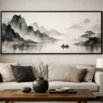

[…] prints, consider motifs that echo reeds, mountains, water, branches, or cloud-like washes. Eastern ink aesthetics work especially well here because they suggest nature without over-explaining it. The result feels […]